UI/UX
UI/UX
Platforms:
Website, Mobile Website
Demographic:
High School Students
Project Goal:
A historical website
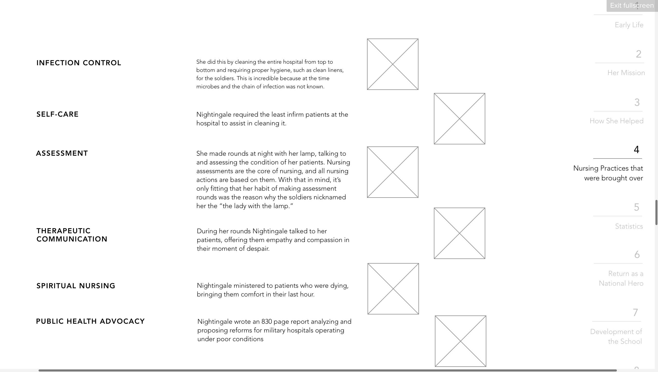
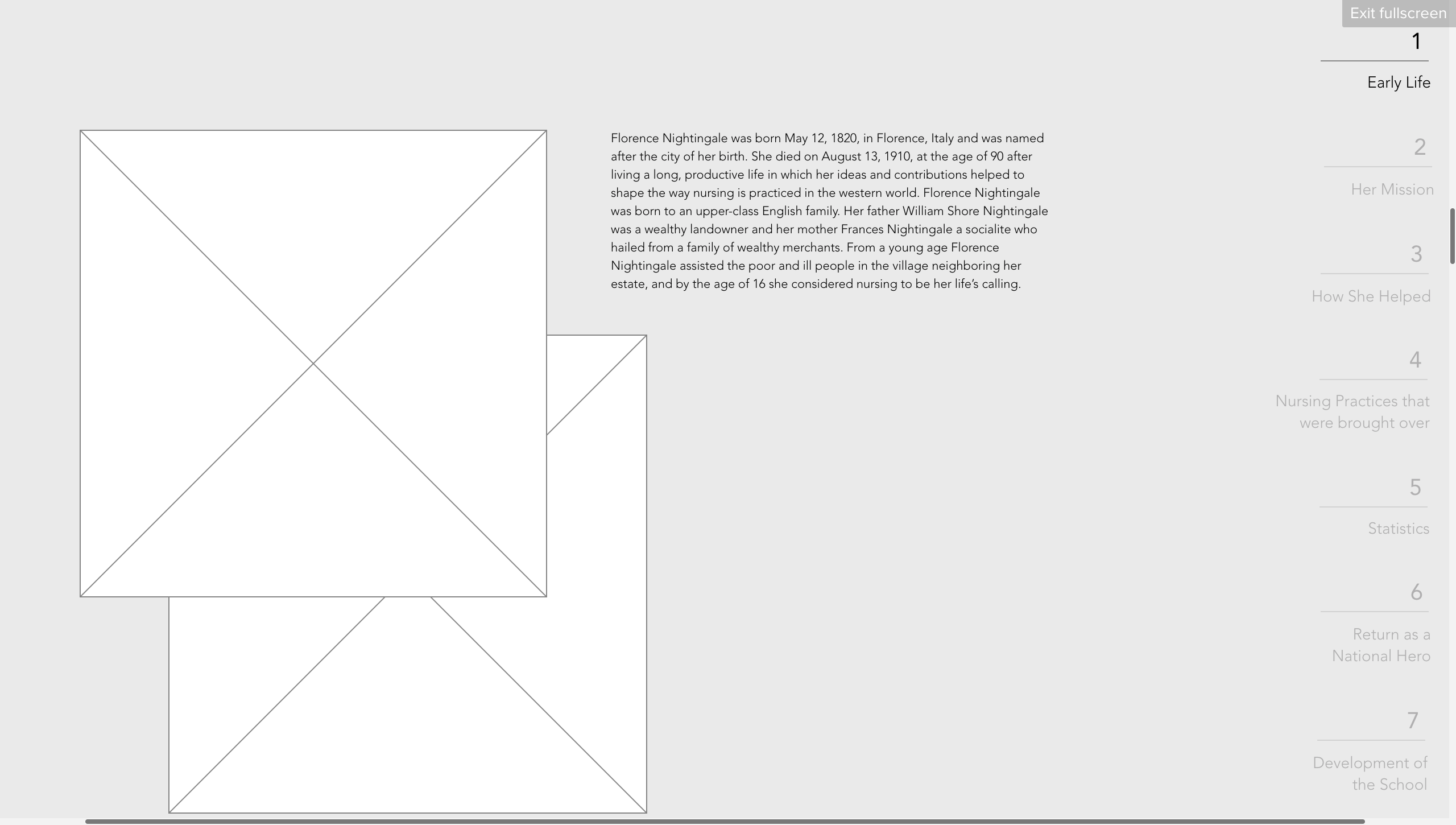
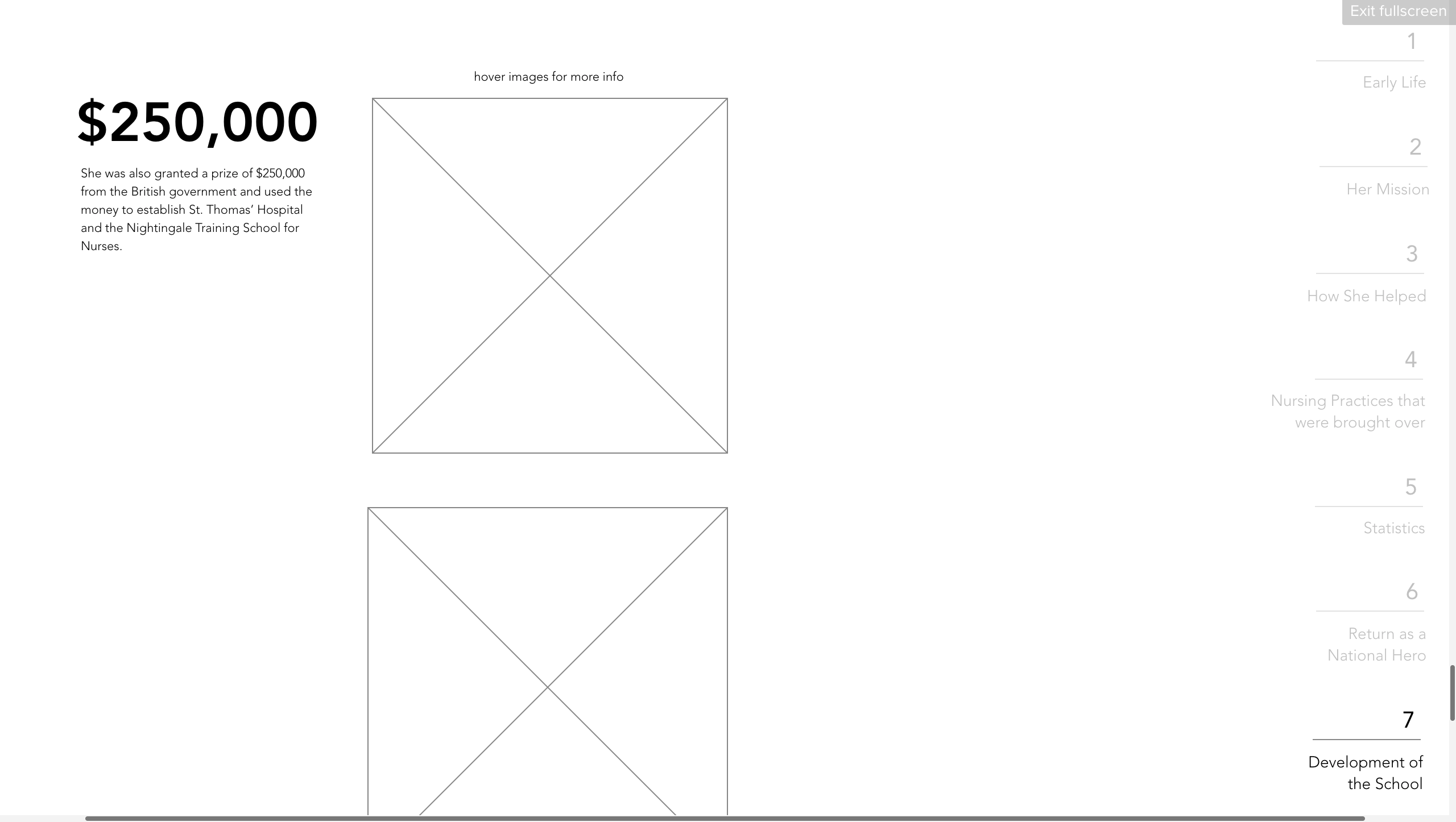
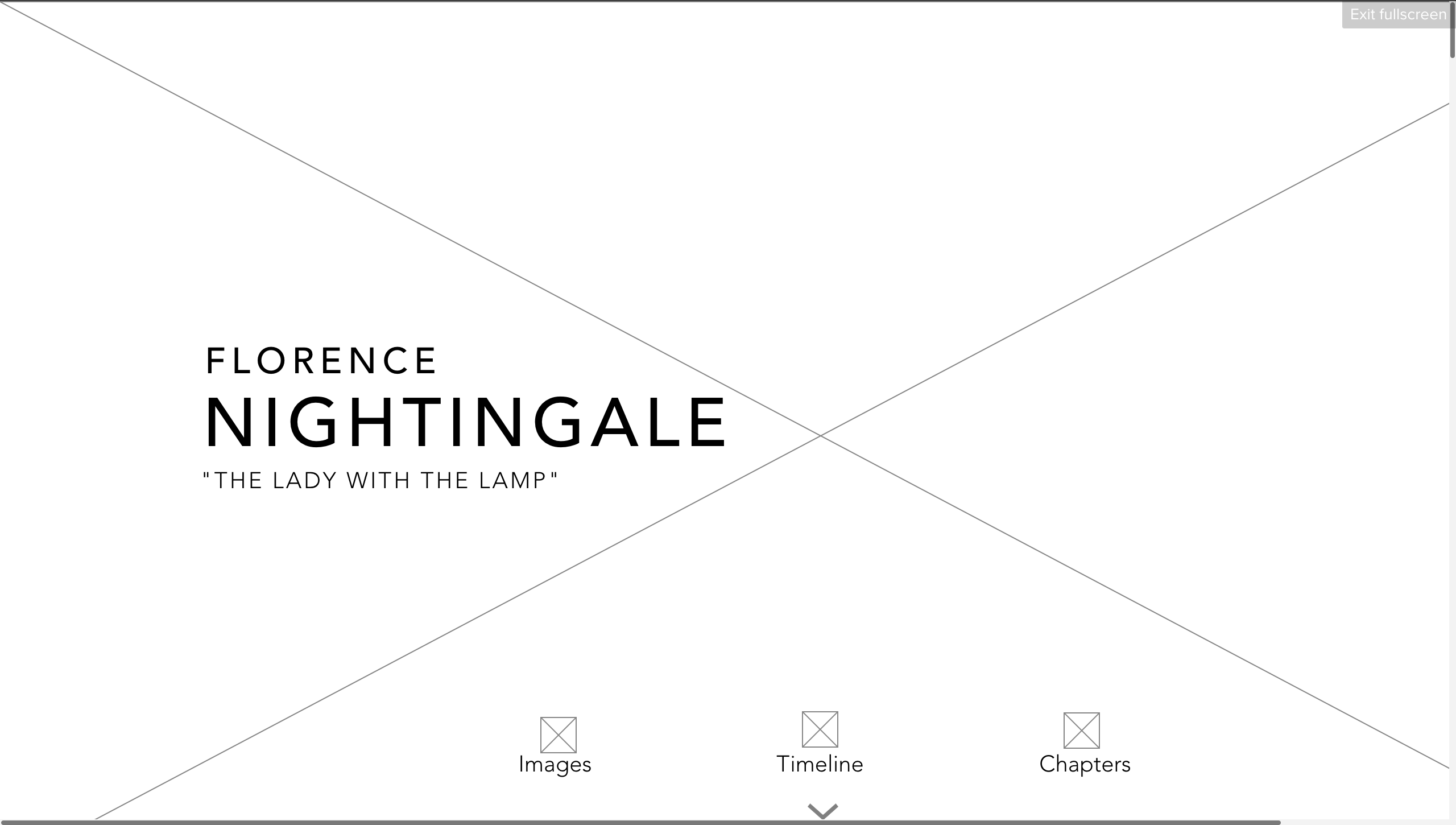
After figuring out the personas for the project, sketching thumbnails, and figuring out the workflow of the pages, next came the wireframes. These are the initial wireframes I had for the project. It was a continuous vertical scroll with a shortcut to click through each chapter.
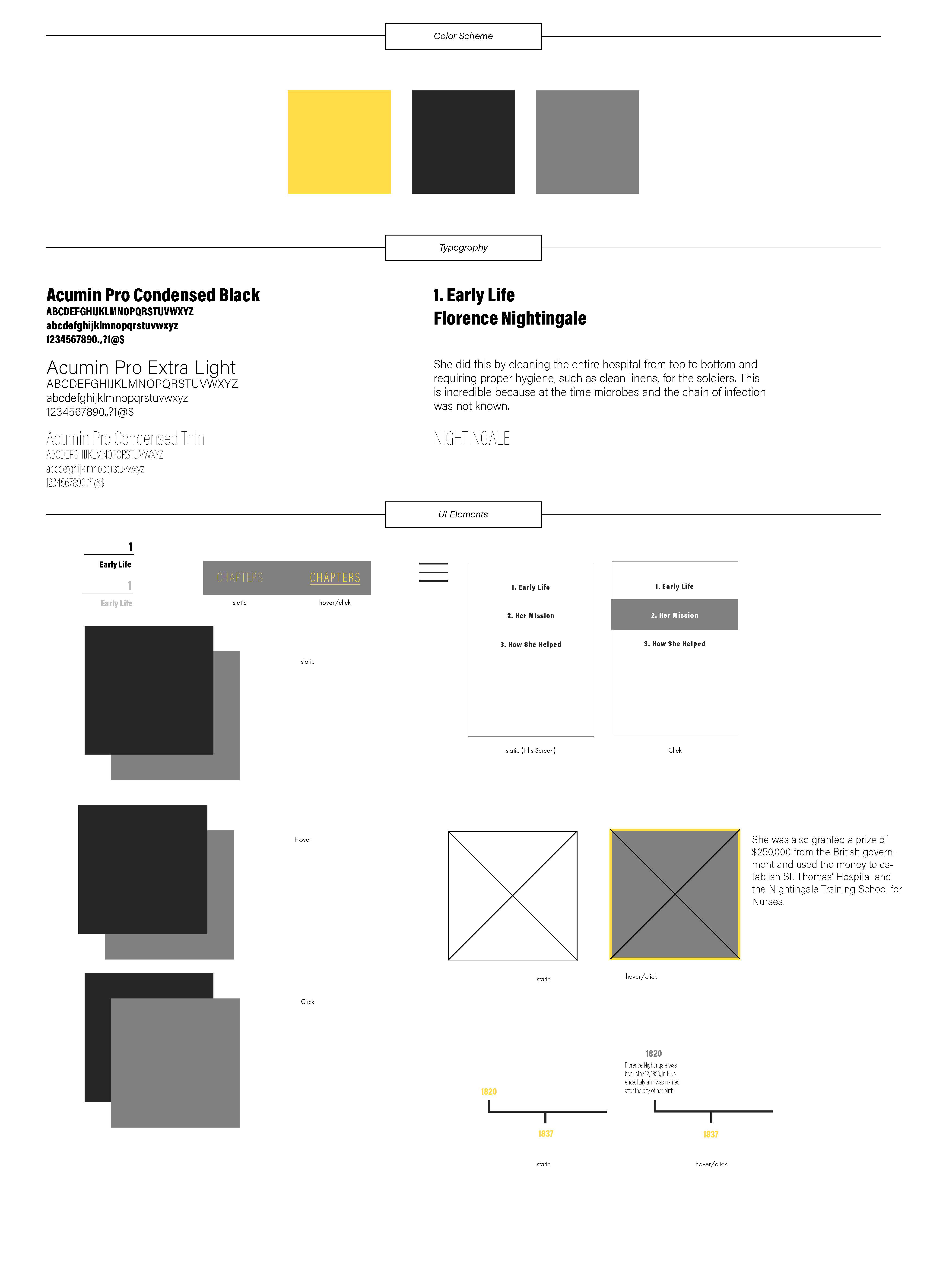
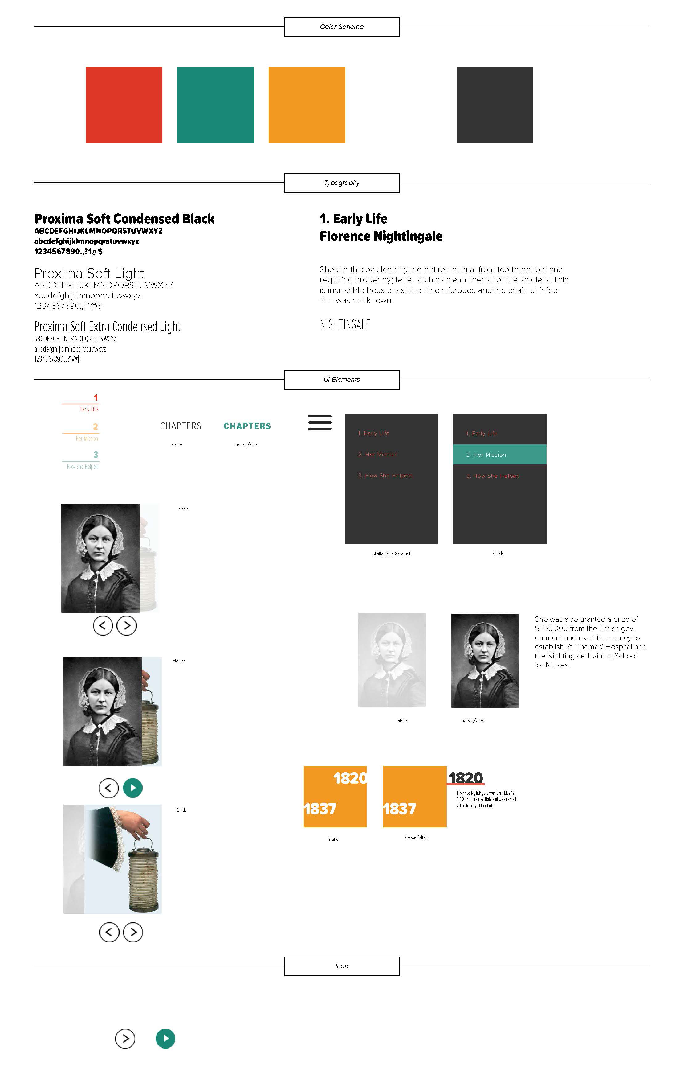
These are some of the style tiles I initially came up with for the project. On the left would be a more professional look, and the right is more colorful with more interactions in order to grab the attention of the readers. The right also included more interaction details to keep the audience engaged while reading through the content.
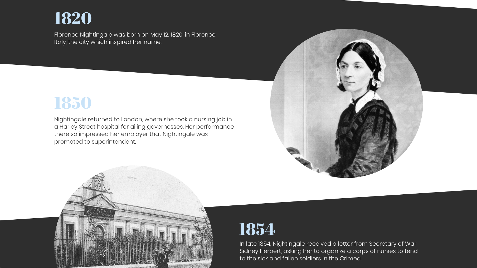
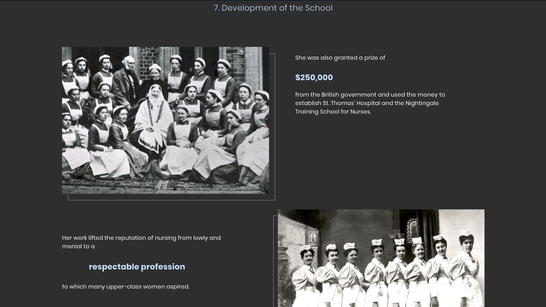
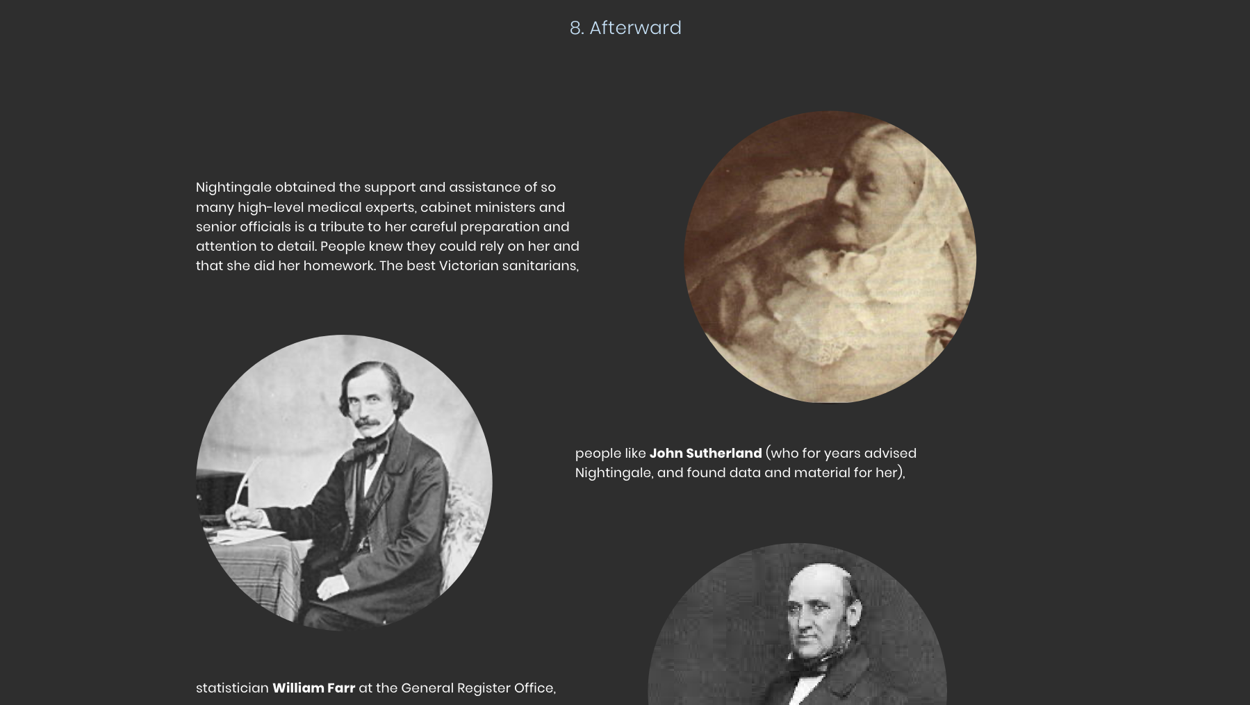
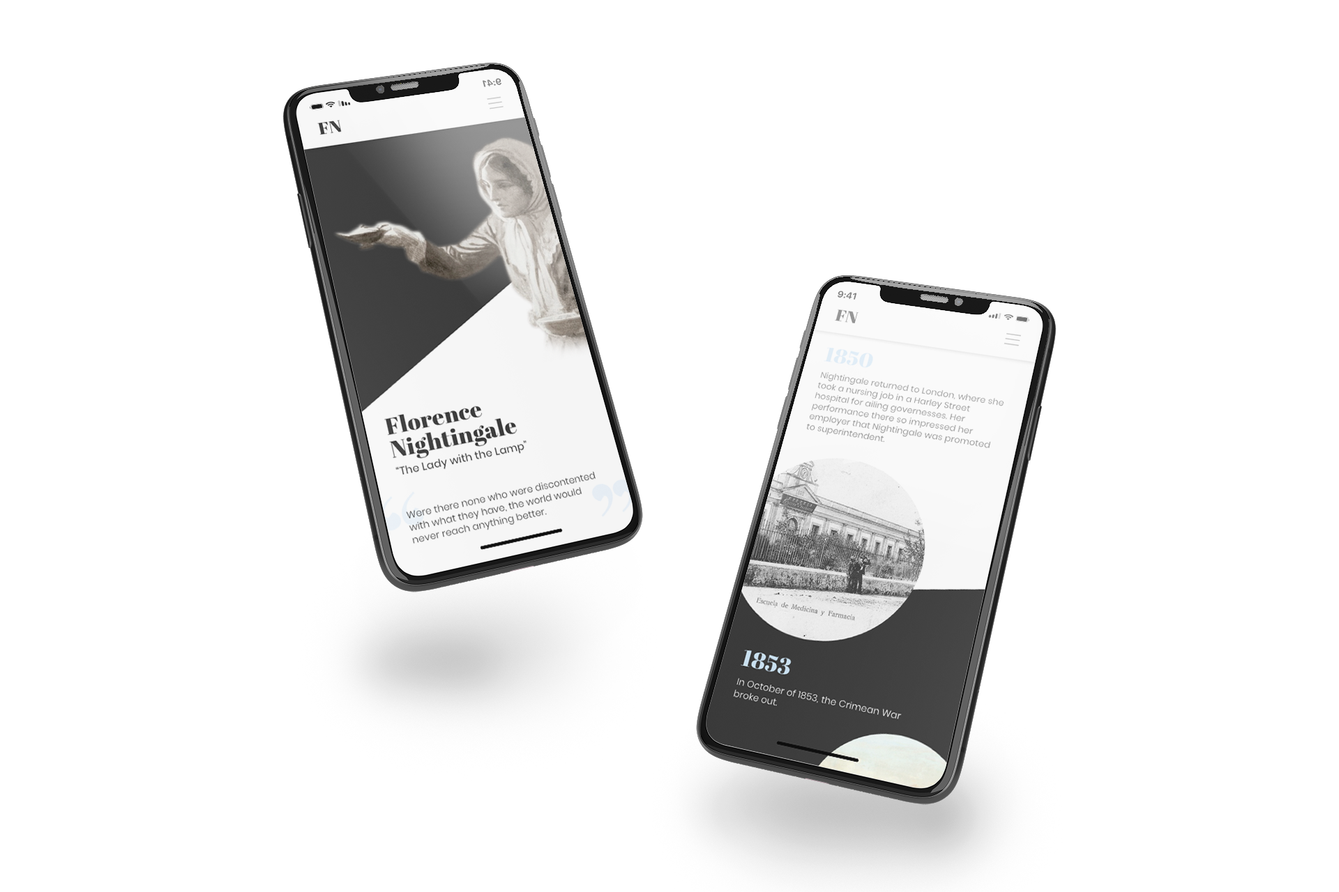
These are some screenshots from the final website. In this final version, I wanted to minimize the distractions that were seen in previous versions. I chose to go back to three colors to be able to emphasize contrast in important areas, and grab the attention of the readers. I chose a more sophisticated look so that the high schoolers wouldn’t feel that they were on a children’s site, and that the informtion would be more detailed.